
Fonts are one of the core elements of typography, determining the legibility, readability, and aesthetics of the text. They influence how a reader perceives the text or even the entire website. You can imagine how these visual elements can make or break the user experience. Eventually, they may also impact the conversion rate of your design.
But choosing the right font can be overwhelming, considering there are more than a million options out there. Each one is a unique form of letters, with different styles, weights, and widths. You should pick wisely because typography can subconsciously influence the readers’ decisions. The next time you consider the typographic elements of your website, you should surely think twice.
In this article, we will discuss the use of sans-serif fonts in web typography and explain their upsides and downsides.
Beginning With the Basics: What is Sans Serif Typography?
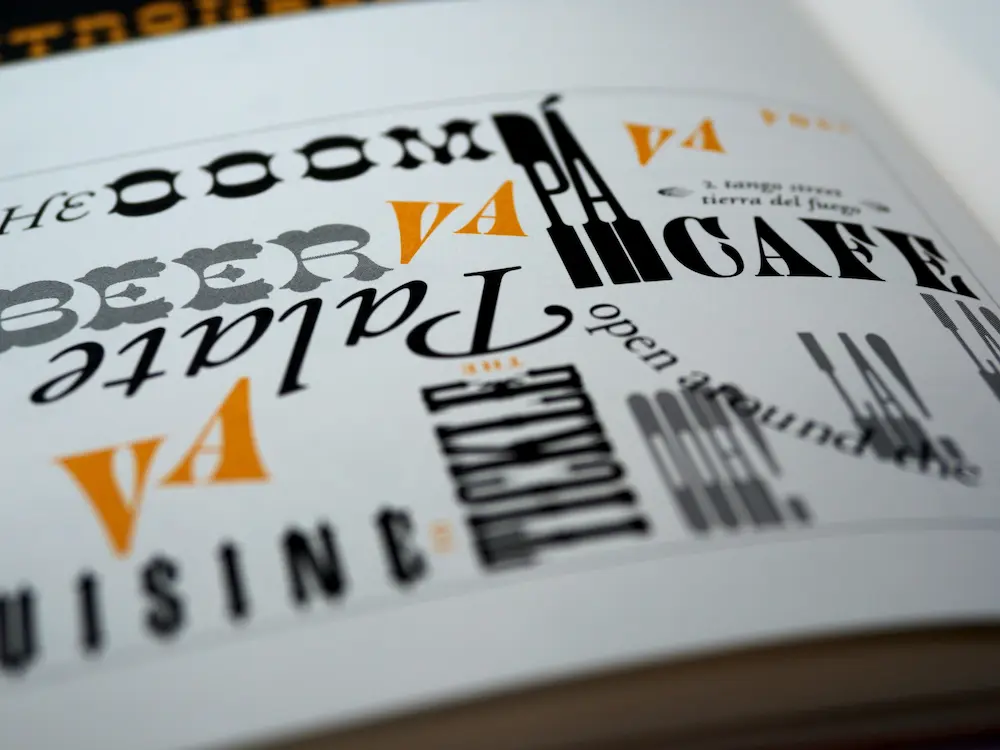
To the unversed, sans-serif typography refers to standard, minimalist, plain lettering. At this point, you may also get into a serif vs. sans serif debate. Serif fonts like Times New Roman and Georgia may seem more alluring because of their design nuances.
Even though sans serif fonts sound basic, this style is perhaps the most popular one for all types of websites across diverse industries because it looks clean, modern, and futuristic. They are also easier to read on screens.
Creative Market notes that the versatility of this font style is another factor making it a favorite for brands. There are several popular sans serif fonts to play with, from a geometric Futura to a grotesque Franklin Gothic, a neo-grotesque Helvetica or Arial, and a humanist Univers.
When to Use Sans Serif Fonts?
Before digging deep into the pros and cons of sans serif typography, you must understand when it is an ideal choice for your web design and brand. Here are some recommendations by pro graphic designers:
- Since sans serifs are known for their legibility and clarity, they make the right font choice when you need to share information in a clear and direct way.
- Sans-serif typefaces are popular in industries such as fashion, tech, consulting, sports, manufacturing, and automobiles.
- Avoid using bold or heavy weights for longer body text.
Upsides of Sans Serif
The next time you explore a font foundry, you should consider these good reasons to opt for sans-serif typography:
Readability on All Devices
Sans serif fonts are easy to read on all devices because of their minimalist appearance. The absence of loops and swirls makes them legible in all sizes, from small caption text to large headings and titles. They render well on small screens of mobile devices, where each letter has less space than on a desktop screen. It is the right font choice for an easy-to-read, scan, and skim website with an excellent UX.
Timeless Appeal
With a sans serif font, you can get the benefit of timeless appeal for your website. The simplicity and stylish appeal of this font means it will never go out of vogue. That’s one reason website designers recommend it- you never have to stress about updating your typography!
Unique Look and Feel
Despite being plain and simple, sans-serif fonts can give your website a unique look and feel. You can explore options such as Proxima Nova, Open Sans, Nexa, Roboto, Garamond, or Comic Sans for a completely unique style and result. No matter how you want to present your brand, you have a range of versatile options to work with.
Effective for Feature Typography
You may feel inclined toward using serif fonts when thinking about titles and headings for your website pages. But sans serif is equally effective for feature text-based content because of the sheer number of lettering options it offers.
Downsides of Sans Serif
Before settling for sans serif typography for your website, you should also dig deep into its downsides because it has some cons. Here are the ones you should be aware of to make an informed choice:
Lack of Character Variation
Since sans-serif fonts feature uniform stroke widths, the lack of subtle variations is often a concern with this family of lettering. It can make them less expressive and dynamic in certain design applications that require more warmth and personality.
Not Suitable for Long or Dense Paragraphs
Sans serif may not be the best option for long or dense paragraphs because the spacing may make text harder to read and scan. Legibility may also be compromised at small sizes, specifically in low-resolution settings.
Less Formality
Another con of sans serif fonts is that they can look too casual or unprofessional due to their minimalist style. You can skip them for professional documents such as letters, contracts, and resumes.
Frequently Asked Questions
Which are the most popular sans-serif fonts?
Arial, Helvetica, Calibri, Proxima Nova, and Futura are the most popular sans serif fonts. But this is a versatile family where you have many more options.
How many types of san serifs are there?
San serif letterforms are classified into major groups such as geometric, grotesque, non-grotesque, humanist, and others or mixed.
Why is sans serif popular?
Readability, simplicity, and legibility across different devices and sizes make sans serif a popular typographic choice for website and graphic designers.
Is sans serif easy to read?
Yes, sans serif scores better than serifs on the readability and legibility front. It makes an excellent typeface for the body of text. But you should avoid monospaced ones.
Conclusion
Hopefully, this comprehensive guide will help you choose your side in the serif vs. sans serif debate. The bottom line is that the choice of fonts boils down to your needs and objectives. You should consider them to pick the ideal one for your website and branding assets. The good thing is that you can experiment with several free fonts to choose wisely.